Help Center Examples Worth Copying (And What Makes Them Work)
 Lena Martinez 6 min read
The fastest way to build a good help center is to study ones that already work. The best examples share a handful of patterns: search sits front and center, categories are named in plain words, articles answer questions the way customers ask them, and there's always a visible path to a human when self-serve fails.
This chapter breaks down those patterns so you can steal them deliberately. For a browsable gallery of real help centers with screenshots, see the examples section on the Academy overview page.
Pattern 1: search is the hero
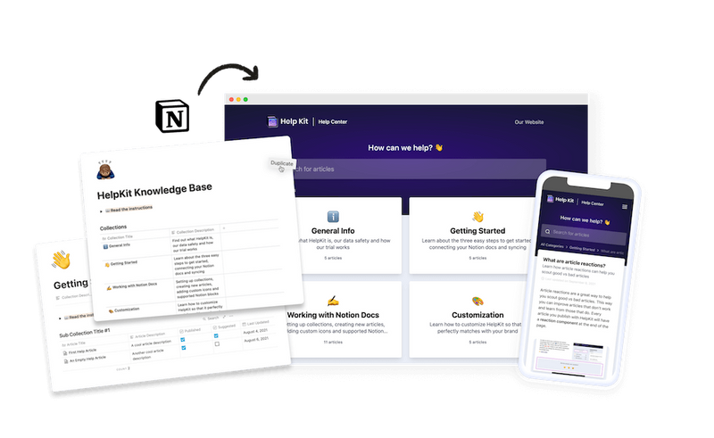
Open any help center you admire and notice what sits in the middle of the screen: a search bar, usually with a friendly prompt like "How can we help?" That placement reflects how people behave. Most visitors arrive with a specific problem and want to type it, not browse for it.
What to copy:
- Search bar centered at the top, large enough to feel like the main event
- Placeholder text that invites a real question
- Results that appear as you type, so people see progress immediately
What to avoid: burying search in a corner of the navigation, or search that only matches exact article titles. If a customer types "invoice" and your article says "billing receipt," good search still finds it.
Pattern 2: categories a stranger could predict
Strong help centers use category names so plain that a first-time visitor guesses right on the first click. Getting Started. Billing. Troubleshooting. Account. You'll see this same skeleton across wildly different products because it mirrors the questions every product gets, which is exactly why we recommend the four-category structure as a starting point.
A detail worth stealing: the best help centers show two or three article titles under each category right on the homepage. That preview lets visitors confirm they're about to click the right door.
Pattern 3: the articles sound like the customer
Compare these two titles for the same article:
- "Payment method configuration"
- "How do I change my payment method?"
The second one wins because it's the sentence a customer already has in their head. Great help centers are consistent about this: titles in the customer's words, written to be skimmed, with screenshots wherever the interface is involved.
This is the pattern that carries furthest: help centers built by turning real support questions into searchable articles, one ticket at a time. Every article earns its place because someone actually asked for it, which is also why those help centers rarely contain filler.
Pattern 4: the help center matches the brand
A help center that looks nothing like the product it serves creates a small moment of doubt: did I leave the official site? The examples worth copying feel continuous with the product. Same logo, same colors, same typography, ideally the same domain (help.yourcompany.com or yourcompany.com/help).
This used to require engineering work, which is why so many small companies lived with a generic-looking support page. It's also one reason we built HelpKit the way we did: your articles live in Notion, and the public site comes out branded, on your domain, without touching code.
Pattern 5: an escape hatch to a human
Every good help center admits that self-serve sometimes fails. Somewhere consistent, usually the footer of every article or a contact card on the homepage, there's a clear way to reach a person.
This isn't a defeat. A customer who read your article and still needs help now writes a much better ticket ("I followed the domain guide, step 3 fails with this error") than one who never found the article at all. Hiding your contact option doesn't reduce tickets; it produces angrier ones.
Pattern 6: one help center per audience
Companies with several products or audiences resist the urge to cram everything into one site. One of our customers builds multiple Shopify apps and runs a separate help center for each one. A customer of one product never wades through articles about another.
The same logic applies to internal versus external content. A public help center for customers and a protected employee handbook for your team beat one confusing hybrid. And education-focused companies take it further, running whole customer academies that teach their product with the same structure a help center uses.
How to use these examples
Don't copy any single help center wholesale. Instead, run this exercise: open two or three help centers from products you personally use and rate them against the six patterns above. The gaps you notice are the same gaps your customers would notice in yours.
Then look at your own help center (or the plan for it) and ask which pattern is weakest. Fix that one first. Once it's live, the next question is whether it's actually working, which is what chapter 5 on measuring help center success covers.
Common questions
What makes a help center look professional? Consistency, mostly. Consistent article naming, consistent branding with your product, categories with similar depth, and no half-empty sections. Visitors forgive a small help center; they distrust a messy one.
Should I look at competitors' help centers? Yes, and read them the way a prospect would. You'll learn what questions their product raises, how they handle the topics you share, and where your answers can be clearer than theirs.
How many examples should I study before building? Two or three studied closely beat twenty skimmed. You're looking for patterns to apply, not a design to clone.